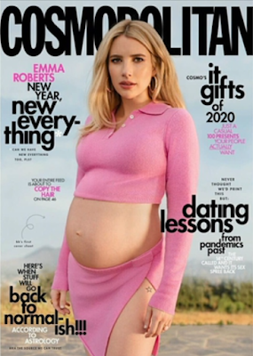
Typography:
- Sans Serif-typical of the convention of lifestyle magazines
- Capitalised brand name- to stand out and show importance of the brand identity, however placed behind Roberts' head highlighting that the brand is important enough
- Bold cover lines- to stand out from shelves and highlight the main articles in the magazines
- Lower case- to represent an informal register to appeal to all audiences, makes it friendly
- Emma Roberts name in capitals- importance of the celebrity on the cover in comparison to cover lines
Iconography:
- No price or barcode- goes against the typical conventions of a magazine
Language and Image:
- Represents underrepresented- pregnancy in a fashion and entertainment magazine
- Pink colour palette of clothing and cover lines- represents feminism, she is pregnant and showing off her bump, which is not common in magazines or high-end media
- Tattoo on show- this is usually frowned upon in the older society, however the younger audience would see this as empowering and female confidence
- 'new year, new every-thing'- links to the catchphrase 'new year, new me' which is popular within the generation z female audience, intrigued to read on how, a guide to a new way to live, aspirational psychometric
- 'it gifts'- reference to 'it girl', extremely popular, encourages readers to read article, intertextuality to 2000's programmes such as Gossip Girl
- astrology= common interest to young adult- adult target audience, aspiration for people to go back to normal after covid, reassurance and draw people in as it is a common interest to the public of the time of release
Soft journalism- offers gossipy topics, about celeb Emma and her new year aspirations, Christmas gift guide, and dating lessons= typical convention of a fashion magazine, no hard news


No comments:
Post a Comment