Candidate number:8061 Centre Number:16607 NEA: Magazines
Monday, February 6, 2023
Sunday, February 5, 2023
Wednesday, February 1, 2023
Final Website Information
Thursday, January 5, 2023
Statement of Intent Draft
Brief chosen: Magazine and Online
I intend to create a magazine, named Elira, which follows the genre conventions of real-life magazines, however, due to the audience being a 16-25 aspirational target, I will try to create a sophisticated and exclusive aesthetic. This will be done by including relevant, up-to-date offering information and a manual to the audience on how to achieve their aspirational lifestyle. In both covers, I wish to include a 'celebrity', which will appeal to the aspirational audience, to give them a role model/figure to look up to. From the research, I have done on lifestyle magazines, they tend to use conventions such as bold fonts, minimalist front pages, cover lines, and a bright and daring main image. This can be seen in magazines such as ELLE and Cosmopolitan. All these features combined will ideally encourage the audience to buy the magazine off the shelves. My product will be published by HEARST; a large publishing conglomerate which, in essence, wishes to 'help people get more out of life' and wish to engage with 'positive people in positive environments'.
Cover 1
For my first magazine cover, I have chosen the topic of Fashion. Due to this magazine representing one of the first editions from ELIRA, I intend to create a series of celebration magazines representing certain fashion eras, the first being the 1970’s ; this will appeal to the 16-25 year old aspiring target audience, due to many of the 70's fashion trends recently appearing in the world of media. The cover star will be a well-known fashion influencer, Daisy ,recreating the iconic looks of the famous influential model Twiggy, acting as intertextuality to the 1970's. This will spark the article on (along the lines of) 'From Daisy to Twiggy'. By using an influencer on the front cover, it will encourage audiences to pick the magazine up from the shelves. Not only this, it will also represent the diversity of my magazine and the society of now, life 50 years on, with a mixed Trinidadian woman being represented as the modern 'Twiggy'. My product will take the morals/remit of HEARST in consideration when choosing cover lines and the particular representation of the magazine. I will use photography of both boys and girls; for example, one of my articles will be on uni-sex clothing and the liberating benefit of wearing what you wish. This will help the aspiring audience feel confident about the future of fashion, whilst also demonstrating acceptance. I hope for my magazine to represent ideas of sophistication, to appeal to the aspiring audience, whilst also displaying a theme of acceptance and body confidence, linking to their socially conscious demographic, as these factors are becoming a rising issue of younger audiences in the media world.
Cover 2
My second cover will be focused on social media trends in Beauty and my cover star will be, Evie, a beauty influencer who became popular on TikTok. This will appeal to my target audience as they are digital natives, therefore they will be able to recognize and look up to famous social media stars and be up-to-date with trends in social media. The colour palette I intend to use will be a bright, saturated palette, featuring a lot of red colours, drawing in the audience and representing bold confidence of the magazine through the image of Evie. Although, I want to create a juxtaposition with the makeup with a plain blank background to draw attention to the cover star. I will try to keep a minimalist theme to the cover, however wish to include a few cover lines which will link with the audience's interests, for example: 'Makeup a Euphoria', 'The Problematic Filter-Perfect face' and 'TikTok Trending: The Guide to Microblading'. The main image will be an extreme close-up, showing both the detail of the makeup, whilst also showing the non-editied perfect imperfections of Evie's skin. This will be a way of appealing to my target audience as due to being digital natives and being exposed to the fake reality of social media, they will be able to appreciate a 'celeb' self-exposed and able to show their true self.
Product 2
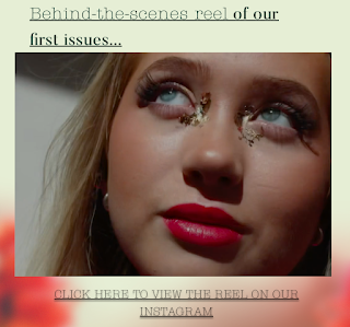
For my second product, I will create a website, in conjunction to the two magazine covers, keeping synergy. All of my products will use neutral aesthetically pleasing colours, like sage, light pink and light purple etc. Although the colors are neutral, due to the conventions, for example, bold modeling and style of photography, it will still be able to be recognisable as Elira. The Aspirer audience will be interested in celebrity stories, up-to-date fashion or beauty trends on social media, therefore I will make sure to include this sort of soft news on the contents page as well as mirrored on my website, as this sort of audience will seek status and knowledge of this sort. There will be an option to subscribe to the magazine or buy one time, like many other online and print magazines, however I will offer a percentage off, encouraged with up-to-date informations about the magazine, to encourage the audience to subscribe so they do not miss out. I am also planning on making an exclusive audio video of BTS of my shoots with all the models to make the online viewers feel more special. This video will feature on the home page and include a link below to the reel on Instagram, to encourage cross-media convergence. My audience will be likely to enage with this link, due to this platform being popular with the young aspirational 16-25 year old audience.
Thursday, December 15, 2022
Wednesday, December 14, 2022
Saturday, December 10, 2022
Process of removing the shadow
How I got this...
First I tried to use the background removal tool, which removed part of Daisy's body, so I had to scrap that idea!
-
The flower gif on the website is a Easter egg for audiences to win a free issue Voice-over for 30s video- my voice


