Thursday, April 21, 2022

Pitch

Magazine 1- Fashion

For this issue, I wish to present Daisy(front cover) as well as Harriet( who will be representing the more general 70's looks) in a few different locations, for example, in a pretty park with greenery and then some pictures with just block colour, to show off my creativity, whilst also harnessing the spirit of model Twiggy. Due to this cover being a celebration of fashion every half decade, 50 years ago, I would like to incorporate a real 70's feel, with both usual lenses and also the black and white distortion also. This will give the magazine an authentic look. Due to many fashion trends being influenced by this decade, It will appeal to this target audience (16-25years) I will not use too many up-to-date articles as will feature in my other edition, as from my research and analysis on other celebration covers, they tend to keep it very minimal, which draws more attention to the image.


Topics or details I wish to include:
  • Bold and confident poses- I want to get creative to embrace Twiggy's wild poses e.g. like some poses Zara models have drawn inspiration from now
  • An article on how we made 'Daisy into Twiggy'- maybe with title 'Daisy as Twiggy'
  • A subheading of Daisy's name( or 'stage name') and her occupation (convention of lifestyle magazines) or just the minimalistic title including her name 'Daisy'
  • Different and bold font for the heading, to stand out on the shelves, whist also representing the brand identity 50 years on
  • Possible article on front covering a 'now to then'
Examples of Contents:
  • Daisy to Twiggy- Exclusive interview with the model herself
  • Now to then
  • The latest fashion trends and where to buy them
  • From Hermes to H&M and from Zadig& Voilare to Zara- comparison/ similar items of high end fashion to cheaper online and high street stores- to fit in the aspirational market of my audience
  • Poll- this or that- on online magazine
  • Bridgerton season 2- outfit breakdown and general gossip
  • Princess Kate re-wears: The breakdown

Magazine 2- Beauty

In this issue, I wish to create a juxtaposition to draw in my target audience, with bright and brave makeup looks yet juxtaposition them with a blank and plain background. Through my research, I have found that many other Hearst magazines use this juxtaposition to keep their audiences interested. I may experiment with different colours, patterns and application techniques to create a strong and powerful front cover.


Topics or details I wish to include:

  • Vivid and Eye-catching makeup- bright colours against the blank background, keep a minimalist and luxury feel
  • Close ups to see detail of makeup and face features
  • Expressive poses (as seen above)
Contents:
  • New Billie Eilish perfume 
  • Euphoria- chat about the show and a how to achieve the perfect 'Euphoria' look for your themed parties
  • The latest makeup trends according to influencer, Poppy Moore
  • Is a 'Gua Sha' really worth the hype? Dermatologist Dr Sally McDaniel reports
  • TikTok Trending: The Guide to Microblading (it's a common section in each issue of the magazine)
  • Should the 90's Brow be brought back? After 'Pam and Tommy' series release

Saturday, April 16, 2022

Representation within the magazine

 I believe that in the magazine industry, it is evident to see that diversity has been more prevalent in issues and online, with diversity in race, gender, sexual orientation, age, ethnicity etc. In the past, magazines tended to show women in expressive roles, like looking after the children and housework, with fairy adverts and magazines on how to excentuate yourself to act in a ladylike ways. Whereas, male lifestyle would feature the more instrumental roles and how to be gentlemen, with topic about war, work and money. These types of stereotypes of gender and in fact all over diversities have begun to change and I would like to reflect this in my issues and cover stories.


1. For my first issue, I would wish to do a 50 year 'celebration throw back' of fashion- this would include a fashion edit of my model, Daisy, who will be turning into the modern day 70's fashion sensation, Twiggy. This will represent diversity, as due to Daisy being Trinidadian and Twiggy being English, she could represent the diversity in modern day modelling and society. For anniversary type editions of Hearst co. I have researched, it is evident that they use this code to celebrate their previous stars featured or success at the time of the anniversary, therefore I believe Twiggy would be a stelar example. Although, it will not be an 'anniversary' per say, I wish to use this same sort of layout, for it to be a reoccurring special for the magazine. I also would wish to make this a common occurrence  annually for my magazine, to celebrate not just fashion,  but special editions on culture etc. 


2. For my second issue, I am planning to do a beauty issue. This will feature different models following the current trends in makeup and beauty itself. I wish to make this issue up-to-date and 'a guide' for the audience to follow and copy. I wish to make it rather minimalist in comparison to the other unique issue of fashion, so I may show a contrast in my media creation, that I can display common modern trends, whilst also up-cycling past genres in fashion and beauty. 


Tuesday, April 12, 2022

Textual Analysis: Vanity Fair

OCT 2013

Typography: 
  • Sans Serif font- typical convention of a magazine
  • Font could be representative of the typical font used in Hollywood movies of the mid 1950's- connoting luxury and fame

Layout: 

  • No barcode
  • Date under title- typical of most Hearst magazines
  • Upton head over text- the magazine is well-known enough that a star can be placed over and it can still be recognised
  • Mid-shot
  • Placement= Upton in the centre with text around her, represents importance
  • The '100 years' is placed over Upton's body as it is a celebration and is the most important aspect of the issue
  • 'Special Anniversary Issue!' placed right at the top of the cover= to be seen if buying in store on shelf
  • Featuring lots of celebritys and people in high society in right hand side- this may be enticing to the audience as not only do they have a feature on Kate Upton but also other celebrities in addition

Language and Image:

  • Playful image= her holding a cake, connotes celebration, 'birthday' of magazine,
  • Upton= looks chic, reference to mid 1950's Hollywood glam, silk= rich fabric, luxury magazine
  • Colour palette- portrays a rich quality and represents ambition, which could be shown in the centenary of the magazine, green also represents positivity 
  • 'Bonus' and 'Plus'- connotes to the reader that they are getting an exclusive package when they buy the magazine and are getting their money's worth


Intertextuality to Marilyn  Monroe- hollywood icon of the 1900's( mid 1900's was her peak)

Male Gaze- Laura Mulvey= Upton is photographed in a silky body suit, which is revealing and represents Upton as sex-symbol to embody Marilyn Monroe- this sexualisation of women in women's fashion and lifestyle magazines is quite common

Hearst Timeline- 1887 to 2018

 1887 -On March 4, a 23-year-old William Randolph Hearst places his name on the masthead of the San Francisco Examiner as "Proprietor" for the first time, marking the beginning of Hearst Corporation. 

1896- With William Randolph Hearst’s encouragement, Richard Outcault develops “The Yellow Kid,” transforming a simple gag panel into the first true example of the comic strip. “The Yellow Kid” leads the charge in Hearst’s trailblazing American Humorist comic supplement.

1897 -Hearst introduces “The Katzenjammer Kids” in the New York Journal. King Features still distributes the strip, making it the longest-running newspaper comic in history.

1900 -The Good Housekeeping Institute, a precursor to the FDA, is founded 15 years after its namesake magazine to improve the lives of consumers and their families through education and product evaluation.

1912 -Hearst’s New York Journal introduces the first full page of weekday daily comics. 

1913 -The first Hearst newsreel is shown, leading to the creation of Hearst Metrotone News.

1915 -Hearst’s International Film Service is formed. Among the pioneer animation studios, the company made movie stars out of characters from Hearst newspaper comic strips, including “Bringing Up Father,” “Happy Hooligan,” “Maud the Mule,” “Krazy Kat” and more.

1930 -King Features launches “Blondie,” which is one of the most widely syndicated comic strips in the world today.

1933- Harper’s BAZAAR is one of the first fashion magazines to do a shoot on location and show a model in motion.

1940- Harper’s BAZAAR’s Editor-in-Chief Carmel Snow famously features a photograph on the cover—until then, covers featured mainly art and illustrations.

1952 -WBAL-TV Baltimore is one of the first stations to broadcast in color.

1955- Hearst Newspapers arranges the first cultural exchange between the United States and Russia, including interviews with top Soviet leaders that led to a Pulitzer Prize. 

1965 -In February, Harper’s BAZAAR becomes the first women’s fashion magazine to feature a man—actor Steve McQueen—on the cover. 

1978 -Hearst launches Country Living as an annual. It becomes a monthly in 1982.

1979- Hearst acquires the Edwardsville IntelligencerHuron Daily TribuneMidland Daily NewsMidland Reporter-Telegram and Plainview Daily Herald.

1980- Hearst acquires First Databank.

1981- Hearst is a founding partner, with ABC, in the predecessors of cable networks A&E and Lifetime.

1986- Hearst acquires Boston’s WCVB-TV- Esquire becomes a Hearst publication.

1987 -Houston Chronicle is purchased by Hearst.

1990 -Hearst acquires a 20 percent interest in ESPN.

1993 -Hearst adds the San Antonio Express-News to its newspapers group.

1994 -Hearst and France’s Marie Claire Album introduce the U.S. edition of Marie Claire.

2000 -O, The Oprah Magazine, a venture with Oprah Winfrey’s Harpo Entertainment Group, is published. It is regarded as one of the most successful magazine startups in industry history. 

Hearst is the first large television station group to commit to a minimum amount of daily candidate discourse-focused coverage of election campaigns. The pledge becomes a cornerstone of the company's "Commitment" effort that continues today.

2001 -Hearst is the first company to commit to a major building project in New York City after 9/11: Hearst Tower. The building is architect Lord Norman Foster’s first skyscraper in the U.S.

2002- ESPN reaches agreement for multimedia NBA coverage, becoming the first network to televise all four major professional sports—NFL, NHL, MLB, NBA.

2004 -Hearst acquires Zynx Health Incorporated, the leading supplier of evidence-based medicine content to more than 500 hospitals across the United States. 

2005 -Hearst, American Land Conservancy, California Rangeland Trust and the State of California form one of the largest conservation easements in history (82,000 acres) in San Simeon, California. 

ESPN is one of the first networks in cable television history to pass the 90 million subscriber mark in the U.S.

2007 -Hearst is the first to launch local HD news programming in Sacramento, Boston and Kansas City. 


2008 -King Features launches Comics Kingdom, a first-of-its-kind digital comics platform. 

The October issue of Esquire features a flexible electronic "paper" cover that allows words and images to scroll across it—a first for magazines—in celebration of the magazine’s 75th anniversary.

2009 -Seattle Post-Intelligencer is the first major daily newspaper to transition to an all-digital model. 

Good Housekeeping launches the Green Good Housekeeping Seal, an environmental extension of the original Seal. At a time when no other company had provided a universal definition of "green,” the Green Good Housekeeping Seal created standards to evaluate products based on their measurable environmental impact.

2010 -Hearst is the first magazine publisher to make all of its titles available to read on every major tablet device.

2011 -Hearst acquires nearly 100 magazines in 14 countries from Lagardère, making it one of the largest monthly magazine publishers in the world and the largest monthly publisher in the U.S.

The WatchESPN app for iPad, iPhone and iPod launches, allowing mobile access to ESPN, ESPN2, ESPNU and ESPN3.com—the first live streaming cable channels available in the U.S. on mobile devices.

2012 -Hearst Tower achieves Platinum LEED certification, the highest possible rating. It also becomes the first commercial building in New York to achieve both LEED Gold for New Construction and LEED Platinum for Existing Buildings. 

2014

Hearst announces the formation of Hearst Health, a brand that encompasses the company’s healthcare information businesses and health ventures.

2016 -Hearst acquires CAMP Systems International Inc. from private equity firm GTCR. CAMP is a leading global provider of software-as-a-service (SaaS) for business aviation, serving more than 19,000 aircraft, 30,000 engines and 1,300 maintenance facilities globally.

2018 -Hearst completes transaction with Rodale, Inc. to acquire the company’s global health and wellness brands. The acquired brands publish 62 print editions and 57 websites in 31 countries.

Hearst takes full ownership of Fitch Ratings Inc., one of the “Big Three” credit rating agencies, after originally acquiring a 20 percent stake in 2006

Friday, April 1, 2022

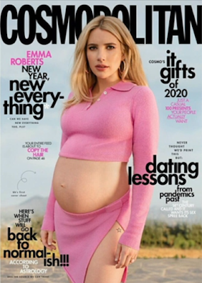
Textual Analysis: Cosmopolitan


DECEMBER 2020
Typography: 

  • Sans Serif-typical of the convention of lifestyle magazines
  • Capitalised brand name- to stand out and show importance of the brand identity, however placed behind Roberts' head highlighting that the brand is important enough
  • Bold cover lines- to stand out from shelves and highlight the main articles in the magazines
  • Lower case- to represent an informal register to appeal to all audiences, makes it friendly 
  • Emma Roberts name in capitals- importance of the celebrity on the cover in comparison to cover lines
Iconography:
  • No price or barcode- goes against the typical conventions of a magazine
Language and Image:
  • Represents underrepresented- pregnancy in a fashion and entertainment magazine
  • Pink colour palette of clothing and cover lines- represents feminism, she is pregnant and showing off her bump, which is not common in magazines or high-end media 
  • Tattoo on show- this is usually frowned upon in the older society, however the younger audience would see this as empowering and female confidence 
  • 'new year, new every-thing'- links to the catchphrase 'new year, new me' which is popular within the generation z female audience, intrigued to read on how, a guide to a new way to live, aspirational psychometric
  • 'it gifts'- reference to 'it girl',  extremely popular, encourages readers to read article, intertextuality to 2000's programmes such as Gossip Girl
  • astrology= common interest to young adult- adult target audience, aspiration for people to go back to normal after covid, reassurance and draw people in as it is a common interest to the public of the time of release
Soft journalism- offers gossipy topics, about celeb Emma and her new year aspirations, Christmas gift guide, and dating lessons= typical convention of a fashion magazine, no hard news


FINAL DRAFT