https://16-mgri.wixsite.com/elira
Thursday, December 15, 2022
Wednesday, December 14, 2022
Saturday, December 10, 2022
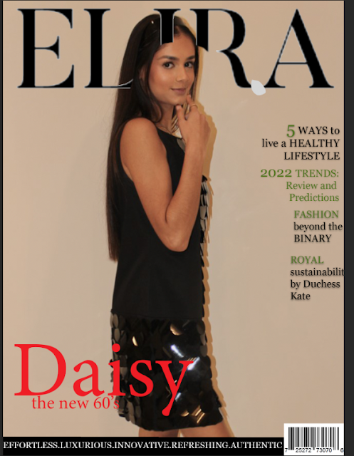
Process of removing the shadow
How I got this...
to this...
First I tried to use the background removal tool, which removed part of Daisy's body, so I had to scrap that idea!
Then I used a picker tool to pick out the colour of the wall nearest Daisy's body, and clicked on the brush tool (size around 10-20) and outlined Daisy's body- where the shadow was- to get an idea of the colour difference of the wall and the body.
Next, once I had drawn the outline, I went back to the colour picker and started to paint in next to the shadow. I decided to paint as due to the wall not being a bright white, the eraser tool would have removed the background of the image.
Although the process of picking and choosing the different paint colours was a rather ling winded process, I believed it was the only way I would be able to get rid of the shadow, as well as the skirting board, without the image looking distorted or tampered with. I wanted my image to look as natural as possible.
Front Covers- fashion celebration- OPTIONS
- coloured headline
- coloured image
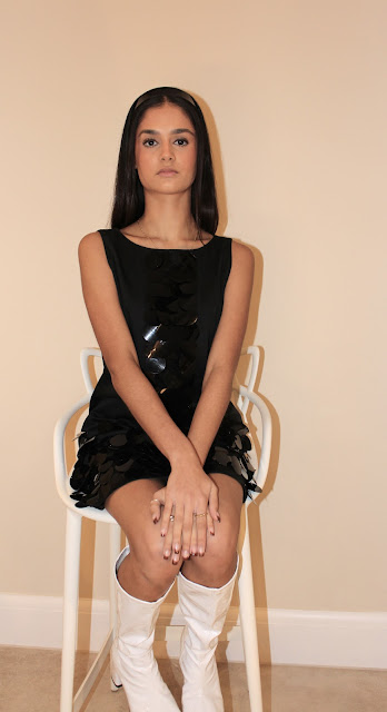
- iconic image, showing the boots
- 3 coverlines- 1 sustainability, 1 lifestyle, 1 cultural and fashion( linking to article about Daisy's mixed Trinidadian heriatge)
- the double colour of Daisy's name (light in front) , like the shadow on the picture- representing the typical 60's font/ makeup trend
- black and white image
- black headline
- iconic image, showing the boots
- 3 coverlines- 1 sustainability, 1 lifestyle, 1 cultural and fashion( linking to article about Daisy's mixed Trinidadian heriatge)
- the double colour and overlay of Daisy's name (dark in front), like the shadow on the picture- representing the typical 60's font/ makeup trend
- black headline
- coloured image
- stood up and turned image
- 4 coverlines- 1 sustainability, 1 lifestyle, 1 cultural and fashion( linking to article about Daisy's mixed Trinidadian heriatge), 1 beauty and trends
- the double colour of Daisy's name (light in front), like the shadow on the picture- representing the typical 60's font/ makeup trend
- coloured headline
- coloured image
- stood up and turned image
- 4 coverlines- 1 sustainability, 1 lifestyle, 1 cultural and fashion( linking to article about Daisy's mixed Trinidadian heriatge), 1 beauty and trends
- the double colour of Daisy's name (light in front), like the shadow on the picture- representing the typical 60's font/ makeup trend
- black and white image
- coloured headline
- iconic image, showing the boots
- 3 coverlines- 1 sustainability, 1 lifestyle, 1 cultural and fashion( linking to article about Daisy's mixed Trinidadian heriatge)
- the double colour and overlay of Daisy's name (dark in front), like the shadow on the picture- representing the typical 60's font/ makeup trend
Wednesday, December 7, 2022
Saturday, December 3, 2022
Monday, November 28, 2022
Updated Front covers and Contents page
This is the main basis of the magazine- can use if I wish to change the picture from my shoot on Friday
Thursday, November 24, 2022
Tuesday, November 15, 2022
New additions to the website
Monday, October 24, 2022
Subscribe to:
Comments (Atom)
-
The flower gif on the website is a Easter egg for audiences to win a free issue Voice-over for 30s video- my voice


